
508 css screen
This PSD file will demo the CSS Screen Tag. This will give you the ability to generate responsive designs for multiple devices, from one Photoshop PSD. This will allow you to create a default layout along with unlimited target screen sizes to match any project requirement.
File Size
8.9 MB
Download Now

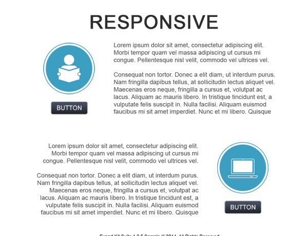
Responsive Screens
This example use 3 target screens to create a responsive design to match a desktop, tablet and mobile layout. The layout of the webpage will auto-layout to match the given CSS media query. Each media query is generate from the PSD design using Responsive Screen Tags.
- 320px (mobile)
- 768px (tablet)
- 1280px (desktop)
Testing the PSD
Use Exports view to see the output of the document when using CSS Screen Tag. This example when exported, should be tested in various browsers to note the difference in output. The fastest way to test is to open the sample in a new window, then resize the window to view each screen layout.
Using Exports View
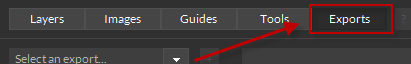
Export the PSD in your required environment to see how responsive screens are rendered in your output.
