
Convert a PSD to Responsive HTML and CSS
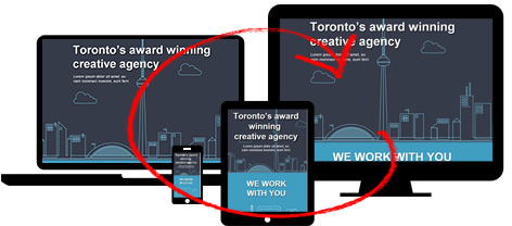
Convert your PSD to Responsive HTML and CSS with Export Kit. Customize your PSD to HTML and responsive CSS output for any device and browser using custom CSS target screens. Use unlimited PSD to responsive CSS target screens to personalize your responsive export.
Step-By-Step Video
Need a visual? Watch our step-by-step tutorial!
Before You Begin
DO NOT create css screen folders BEFORE you have approved the overall design of ALL pages included in the Output. This will save you lots of editing time.
IMPORTANT: At this point you should save a copy of your current [.psd] file, this is just a backup.NOTE: Read our guide for Using Multiple PSD files with One Project, if you have many PSDs that you plan to convert to Responsive HTML and CSS.
Responsive Design Rules
1. You design the responsive css screen, not us!
Export Kit will not assume you want an element in a particular position or size when you output your responsive css screen. Your design is just that – your design! Export Kit allows you to customize each target screen so you can personalize your Output for that screen.
Your responsive design should look the way you want it to look, not the way we think it should!
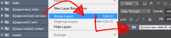
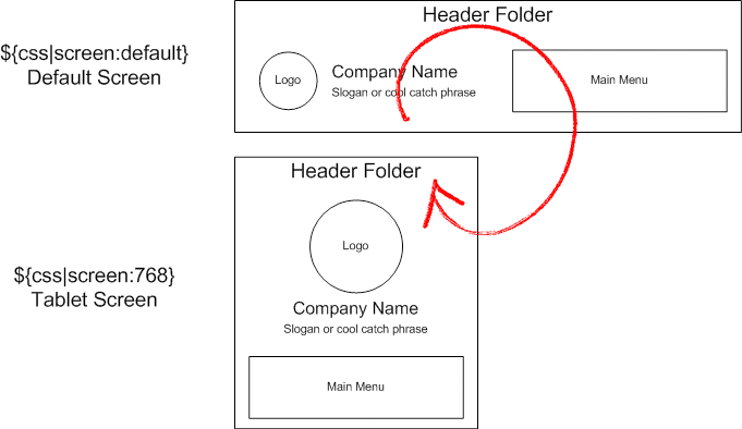
2. You MUST create a ${css|screen:default} tagYou will need a default responsive css screen when using CSS Screen Tags.
You can do this quickly by grouping your entire PSD document and naming the folder group “${css|screen:default}“.
NOTE: Default screens are not required for Android.3. You need 1 screen folder per target screen
If you have 3 target screens – eg. Desktop, Mobile and Tablet, then you will need 3 css screen folders to support the design.
4. You CAN change the size, position and effects of layers
Each responsive css screen folder allows you to change the look and feel of your Output to target the user screen size. You can customize the element size, position and effects for each individual css screen folder.
5. You CANNOT change the layer nameThis is a CSS3 rule, where media screens must reflect the same element in the HTML page.
DO NOT change the layer names in css screen folders!
Common Responsive Screen Sizes
You can cut and pates any of the following tags and use them as your responsive css folder group name.
${css|screen:160} Smartphone All${css|screen:240} Smartphone Portrait${css|screen:321} Smartphone Landscape${css|screen:760} Tablet${css|screen:768} iPad${css|screen:1224} Desktop/Laptop${css|screen:1824} Widescreen You are not required to create all these screen folders. This is only a list of common screen sizes to use.
Step 1: Create Your Default Screen
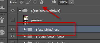
NOTE: Default screens are not required for Android. Close all your folders. Group all your folders including Page Tag folders and name the new layer group “${css|screen:default} default screen“. This will create your default responsive view based on your PSD document size.
We recommend you start with the LARGEST responsive target screen size and work-down in size when creating css screen folders. This will save you lots of time when creating additional css screens.
Working With CSS Styles
CSS is compiled in order – last in, last out. This means that you MUST add your custom styles at the TOP of your PSD document, otherwise the layer elements will maintain their layer effects/styles without change. This includes responsive designs, keep your CSS Styles at the very top of your layers.
NOTE: You are not required to do this with Android.Learn more about using CSS Styles Tag.
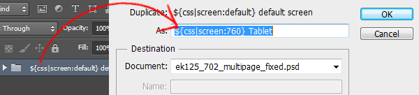
Step 2: Create A Target Screen
Copy a css screen size from the list above, eg. ${css|screen:760} Tablet. Select your default screen folder, ${css|screen:defulat} and duplicate the folder group.
Then paste the css screen you copied from above, eg. ${css|screen:760} Tablet into the new folder name. This will create your target screen based on your CSS Screen Tags folder size.
Smaller Screens Below
CSS3 has strict rules when rendering responsive designs, you need to have the smaller target screen rendered before larger ones. Because the Export Process is a bottom-up process, you need to place your smaller screen folders below the larger ones in your PSD document.
Hide The Previous Screen
To make it easier to edit the PSD, you should hide the previous screen you just duplicated. You can un-hide the screen before you export the Output.
Modify Your Screen Design
You can now modify your new css screen folder and its contents to match your target screen design. You can resize any or all content, change layer effects and positions of all elements in the new css screen folder.
IMPORTANT: You can change ANY layer property including color, size, and effects; but DO NOT change the layer names in css screen folders!Adding Additional Target Screens
Repeat this step for each target screen you require in your project. You can add unlimited css screen folders to personalize your Output. Try to add as many screens as you can to target the devices your project requires.

There are many ways to handle additional target screens when Using Align Output and Hide Overflow with your export. This will allow you to use fewer target screens to support multiple sizes.
CSS3 RULE: YouMUSTplace your smaller CSS target screensBELOWthe larger ones or you will have unexpected results in your output.
Add a Minimum Target Size
You should always add a base or minimum target screen along with your default to prevent display errors. When using Responsive Screens, each screen you create in Photoshop will ONLY render if that target size is met.
NOTE: Export Kit does not limit the number of css screen folders you use, but the more layers and folders in your PSD - the longer the export time.
Minimum Target Error
EXAMPLE:${css|screen:1080}will only trigger if the screen is aminimum of 1080pxwide. This means that any screenbelow 1080px WILL NOT render- because CSS requires that target size!
When you add a minimum target you can cover all devices that are larger than the minimum; eg. ${css|screen:320} will target most common devices and display on that screen as long as the device is wider than 320px.
TIP: You can also read about Using Align Output and Hide Overflow to control the look and feel of your output, and allow you to target multiple device sizes using a single target screen.
Using Multiple PSD Files
Read our guide for Using Multiple PSD files with One Project, if you have many PSDs that you plan to convert to Responsive HTML and CSS, or if you want to manage a single project with multiple files.
Step 3: Responsive Elements
You should always finalize your design BEFORE you create responsive css screen folders. There are situations where you may want to add elements to your responsive design that are NOT included in your default screen.
Single Screen Elements
Each project has different requirements, in some situations you may require an element to only be visible on specific target screens. An example of this is a responsive mobile menu. Your project may require you to display a toggle icon on screens below X size.
HIDDEN LAYERS: If you enable Include Hidden Layers with your export you can hide your element.
TRANSPARENT: You can change the opacity of the element to 0.
BACKGROUND COLOR: You can change the color of the element to match the background color.
Adding Elements After You Export
1. You MUST add the element to ${css|screen:default} firstYou can control elements in any css screen folder, but you MUST add the element to the ${css|screen:default} folder first. This will register the element for the output.
If you DO NOT want the element visible in your default screen then, (1) Hide the element and enable Include Hidden Layers, or (2) set the element alpha to 0.
2. You MUST copy the element to ALL css screen folders
If you have multiple target screens you want to include the new element in, you will have to copy the element to ALL css screen folders, then hide the layer inside css screen folder that you are not targeting.
This will give you access to the element for that target screen, and make the element invisible on other screens.
alpha of the layer to 0.X is the number of times the layer has been copied.Eg. “New Responsive Layer Copy 2”
– Delete “Copy X” from your layer name.
MUST have the SAME layer name.Step 4: Your Responsive Settings
You MUST enable Relative Positions to use Responsive CSS. Once you Enable Responsive CSS and Images you can optionally use responsive image assets as well.
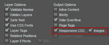
NOTE: Responsive Image Assets will resize images per target screen. This will allow your server to save bandwidth when a user is on a desktop vs. mobile.
