
Create a Pure CSS Dropdown Menu

Create a pure PSD to CSS Dropdown menu in only a few steps with unlimited potential. Many websites have complex CSS menu systems which require more than a traditional single-level menu. CSS Dropdown menus can help a user to navigate to more sections of a website from a single entrance point.
Step-By-Step Video
Need a visual? Watch our step-by-step tutorial!
Step 1: Design Your Menu

Your PSD to CSS dropdown menu design can be anything – go nuts! You are not limited to your creativity with your design, but there are a few design elements you must incorporate to generate a functional dropdown menu.
Note: CSS Dropdown menus can have 1 or more sub-menus attached to items. This allows you to create complex navigations - but not too complex where you confuse the user!
We recommend you design your items first, then create your sub-menus as required per item.
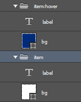
Menu Items
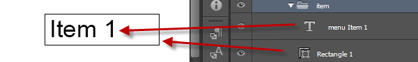
Each menu item is normally a button or link text element. You want all buttons in our menu to reflect the same design in your PSD, this will allow you to better control all buttons with CSS classes in the output.
Note: A button will typically have alabeland abackground (bg)element.
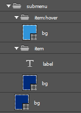
Sub-Menu
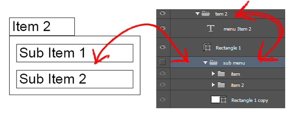
Your sub-menu will have a secondary list of menu items. You can design your sub-menu in the PSD to look the same or different from the main menu items – it’s up to you. It’s important though to note where you place the sub-menu in your Photoshop layers.
Sub-menus should be designed in such a way that the user does not have to move their mouse too far from the menu item, to navigate the sub-menu items.
Note: You should always place sub-menus as children of their parent item in your PSD design.
Step 2: Define Your CSS Layer Style
Next we want to customize the look and feel of our menu. To do this we Create Custom CSS Styles to use with our menu items. The PSD to CSS styles we create will “tell” our element (eg. button) how to display, and what to display based on view states; eg. hover or active.
We suggest you create your CSS Style for each layer in your design first.
Sub Styles
Export Kit has a very powerful PSD to CSS engine so you can create unlimited PSD to CSS targeted styles which can apply to any or specific elements in your output. You should always create sub styles for your classes to keep them organized.
Assume we have 3 menu items:
- ${css|style:
item} item1 - ${css|style:
item} item2 - ${css|style:
item} item3
The very first style you would naturally apply is an item style. To create sub styles, you go in more detail with your nesting, eg:
- ${css|style:
item item1} item1 - ${css|style:
item item2} item2 - ${css|style:
item item3} item3
Doing this will allow you to have greater control with your CSS Styles Folder elments. You can then render CSS styles for item as a group, or individually to each; item1, item2, item3.
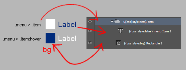
Note: Because each item also has children (label and bg), you can now directly target children element also; eg. item2>>label.Step 3: Create Custom CSS Classes
Your CSS Styles Folder in your PSD may end up with a lot of styles defined – this is normal. The more you define your PSD to CSS classes, the more you can personalize your output to meet your creative requirements.
Menu Item CSS Styles
You can control the children element of item with our CSS class nesting. Because your elements for label and bg are within the item folder, these styles will now target directly child elements; eg. item>>label.
Using CSS selectors, you can also add styles for states such as :hover or :active. Child layers you add in any selector folder will only apply to that CSS layer query.
Eg. In this example we want the menu item background to bewhite, but change todark bluewhen the user hovers.
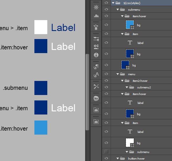
Sub-menu Item CSS Styles
Because you added an individual style to the submenu in the PSD, you can now control each child element independently, but also have a parent child CSS relationship. This means that submenu styles will inherit item styles when rendering.
Eg. We want an item in the submenu to have adark bluebackground, but change tolight bluewhen the user hovers.
CSS Dropdown Logic
This is assuming you are using Sub Styles such as:${css|style:item item2}${css|style:submenu submenu2}
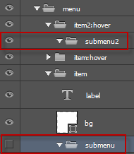
When you enable Hidden Layers in your output, you open your PSD to CSS capabilities to include elements which will only become visible under your custom circumstances.
You can use this logic to create multiple nested menus.
Hide the Submenu by Default
You dont want your submenu to be visible unless the user hovers over item2. So your submenu is not visible by default, therefor you hide the folder submenu in our CSS Styles Folder.
Show the Submenu on Rollover
To show the submenu when the user hovers over item2, we can simply make the folder visible in our CSS Styles Folder.
