My output stacks the responsive screen designs« Back to Questions List
When I export a responsive webpage from photoshop it stacks the different versions of the webpage on a single webpage instead of making it responsive. Do you know why this would be? |
 Do you have the right answer? If you do other users will benefit from your contribution, share your knowledge with the community!
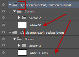
 Based on your PSD we found the actual problems. Invalid Layer TagIssue #1: You did not use the correct tags We also did not notice this as its apparent in your previous screenshot
- that's how easily Maintain Responsive Layer NamesIssue #2: //exportkit.com/learn/optimization-tips/layer-tag-tips/maintain-responsive-layer-names You changed the name of the layer “White BG” to “White BG copy 3” when you copied it – you must have the same layer names in all screens. In your case this would have caused your White BG copy 3 to show on all screens regardless (possibly block out other elements). We also offer a full PSD Optimize: //exportkit.com/product/photoshop/support-advanced. |
Thank you! I sent you an email to the support team. |
Hi, our Support team sent you an email regarding how to submit a PSD. We keep all PSD links private. Missing Default ScreenPlease note that you must follow all instructions in our guide: //exportkit.com/plugin/environments/html5/convert-a-psd-to-responsive-html-and-css. The previous image we showed uses a QUICK FIX: Change Your original image does not have a INDUSTRY RULES APPLY: These are CSS rules – if you only add screen queries to your CSS without base definitions – your output will have visual errors. Responsive PSD Template (Single Page): //exportkit.com/learn/psd-templates/advanced-dynamic-height/ek125_801_webpage_responsive. Responsive PSD Template (Multiple Pages): //exportkit.com/learn/psd-templates/advanced-dynamic-height/ek125_803_psd_to_html5. |
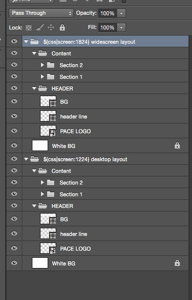
For some reason it is still stacking the designs. Is there a way I could send you the PSD? |
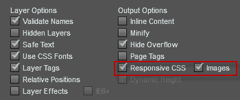
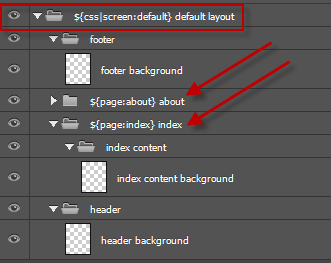
There are a few things to note with your layer structure, with a few quick fixes your layers should look like the image above. Read more about organizing folders and layers ( 1. Layer order is important, layers are processed bottom up. When you are using Dynamic Height you must stack your layers correctly. Keep backgrounds relative to your content sections, eg. header background, content background, etc. Fix: Move your Learn more about Dynamic Height: //exportkit.com/learn/how-to/export-your-psd/export-pages-with-dynamic-height – this will stack your folders (required for responsive designs). Enable Responsive CSS You must enable Responsive CSS in the output ( |
Let me know if the link doesn’t work |
Hi, Send us a response email or use our Customer Support: //exportkit.com/support to cut-and-paste images. There are also several online services which offer screenshots with public web links, google "online screenshots". |
Is there a way to send you a screen shot through this FAQ or do I need to email it to you? |
Can you send us a screen shot of your Layers in Photoshop. Open your folders with the screens and take a capture – we can give you a quick answer. Here are a few possible reasons: Did you include your ${css|screen} tags?If you create your screens but do not include the tags to define them, then your results will be the same as you described with all screens stacked. Did you change the names of elements in your screens?CSS has very specific rules for rendering responsive content, you must have the same element names in each screen and CSS will apply the styles when screen changes. If you change your element names in each screen – then your result can also be the same as you described. ResourcesLearn more about Creating Responsive Screens. |
 Looking for another answer? View other questions in or get premium support for guaranteed results.
Share Your Knowledge!
Contribute to the community and help other users to benefit from your answer with experience and knowledge.


