
Responsive Target Screens Sizes
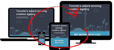
Export Kit makes it easy to create Responsive target screens for mobile, web and desktop projects. You can customize your design to match any requirement, and target unlimited screens.
DO NOT create css screen folders BEFORE you have approved the overall design of ALL pages included in the Output.
This will save you lots of editing time.
At this point you should save a copy of your current [.psd] file, this is just a backup.Read our tutorial on Converting a PSD to Responsive CSS for a full step-by-step tutorial.
Adding Target Screens
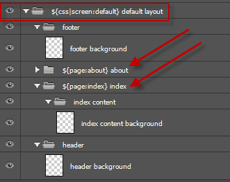
You can cut and pates any of the following tags and use them as your responsive css folder group name inside your PSD.
YouMUSTplace your smaller CSS target screensBELOWthe larger ones or you will have unexpected results in your output.
Mobile
${css|screen:160} Smartphone All (+older)${css|screen:240} Smartphone Portrait${css|screen:321} Smartphone Landscape${css|screen:760} TabletAndroid
Note that default is not required for Android, you should actually set the size you are targeting, also try to use p = portrait or l = landscape in the screen name .
Read more about working with Android and Multiple Screens.
${css|screen:800} p-2560 xhdpi / 1280 mdpi${css|screen:960} l-1200 xhdpi / 1080 mdpi${css|screen:600} p-1200 xhdpi / 1080 mdpi${css|screen:384} p-768 xhdpi${css|screen:360} p-720 xhdpi / 1080 xxhdpi${css|screen:533} l-480 hdpi${css|screen:320} p-480 hdpiiPhone / iPad
${css|screen:640} iPhone${css|screen:750} iPhone 6${css|screen:768} iPad${css|screen:1024} iPad Mini${css|screen:1080} iPhone 6+${css|screen:2048} iPad RetinaWebsites
${css|screen:768} Monitors All (+older)${css|screen:1024} Desktop Safe${css|screen:1224} Desktop / Laptop${css|screen:1824} Widescreen
