Responsive Webpage

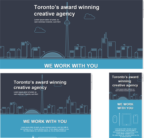
This is a full PSD to responsive HTML and CSS webpage. This sample will demo CSS media queries for 3 target screens with along with responsive assets generated from a single PSD file.
IMPORTANT: Responsive webpages are considered an advanced output, we strongly recommend you read our online guide to learn how to create responsive webpages - learn more.
Preview Now
Remember to view source!
Responsive Screens
This example use 3 target screens to create a responsive design to match a desktop, tablet and mobile layout. The layout of the webpage will auto-layout to match the given CSS media query. Each media query is generate from the PSD design using Responsive Screen Tags.
- 320px (mobile)
- 768px (tablet)
- 1280px (desktop)
Images, Shapes and Text
This sample uses various layer types including folders, images, shapes, text, smart objects and more to create a practical PSD design for a res
Effects and Styles
This sample uses various layer effects and styles to achieve the optimal layout. Effects are used in most common project designs and are easily managed with Export Kit.
Layout and Overflow
With Export Kit you can align your page output and hide the content overflow to create both Flush and Fluid layouts.
Suggested Testing
View the sample on various devices to see how each will render CSS media queries. The fastest way to test is to open the sample in a new window, then resize the window to view each screen layout.


