CSS Screen Tag
${css|screen:args}- usage : ${css|screen:default}
CSS Screen Tags give you the power to create responsive HTML5 and CSS3 websites from your PSD file. You can define multiple screen sizes to support any number of devices inlcuding desktop, tablet and mobile.

folders only.Common Screen Sizes
You can set the screen size to any custom size, but generally here are a few common sizes:
- default (required)
- 320 (mobile)
- 768 (tablet)
- 1280 (desktop)
Example: ${css|screen:default}
Example: ${css|screen:1280}
Example: ${css|screen:320px}
Enable Screen Tags
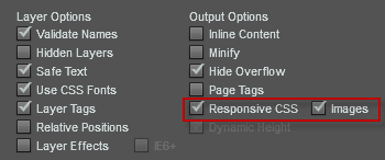
To enable Responsive CSS layouts, you must enable [Customize] and [Responsive CSS] in exports view. You can also include responsive image assets to reduce the bandwidth on smaller devices such as mobiles.


