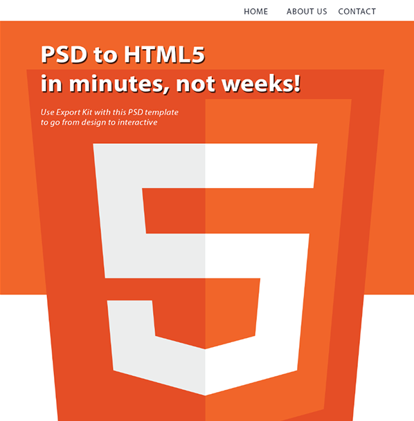
Responsive Multi-page Website

This is a full PSD to responsive HTML and CSS website with advanced PSD to HTML features such as Google Maps, all integrated within Photoshop. This sample will demo CSS media queries for 2 target screens with along with responsive assets generated from a single PSD file.
Each page is responsive and uses the size of the design content – not the document. This export uses multiple layer tags and effects to demo a complete website export with responsive, dynamic height, multiple pages, JavaScript plugins, and navigation menus.
IMPORTANT: Responsive webpages are considered an advanced output, we strongly recommend you read our online guide to learn how to create responsive webpages - learn more.
Preview Now
Responsive Screens
This example use 2 target screens to create a responsive design to match a desktop and tablet layout. The layout of the webpage will auto-layout to match the given CSS media query. Each media query is generate from the PSD design using Responsive Screen Tags.
- 700px (tablet)
- 1200px (desktop)
Google Maps
Because Export Kit allows you to customize your HTML5 Content before export, you can add both custom CSS and JavaScript.
Navigation Menus
Nav Menus are a group of anchor links used to direct users to both internal and external pages. Nav Menus are involved in all common designs for both websites and applications.
Web Forms
Export Kit allows you to fully customize your web forms and data to create data-driven websites in a matter of minutes, without coding.
Images, Shapes and Text
This sample uses various layer types including folders, images, shapes, text, smart objects and more to create a practical PSD design for a res
Effects and Styles
This sample uses various layer effects and styles to achieve the optimal layout. Effects are used in most common project designs and are easily managed with Export Kit.
Layout and Overflow
With Export Kit you can align your page output and hide the content overflow to create both Flush and Fluid layouts.
Suggested Testing
View the sample on various devices to see how each will render CSS media queries. The fastest way to test is to open the sample in a new window, then resize the window to view each screen layout.


