
Responsive CSS and Images
Responsive designs are the norm with a modern Website, this option allows you to toggle between static and responsive media queries.
IMPORTANT: You MUST enable Relative Positions to use Responsive CSS.Learn more about using CSS Screen Tag and how to create Responsive Target Screens in your design.
Export Kit Pro Output Options
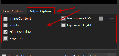
Enabled
If enabled, this will allow you to use CSS Screen Tags eg. ${css|screen:default} with your layer folders.
You can create unlimited css screens but note – the more folders you have in your PSD, the longer the export – learn more.
Responsive Image Assets
You can also include responsive image assets to reduce the bandwidth on smaller devices such as mobiles. Click Images to enable, this will save each image layer, respective to the size in each css screen.
Disabled
Your document will render your responsive screens as elements in your main design.
