
Add CSS Rollover / Hover Effects
Your PSD to CSS export supports unlimited hover and rollover effects, including other CSS states also. PSD to CSS rollovers support text, images, shapes and folders in your Photoshop document. Using a few layer tags you can customize the look and feel of your PSD elements with any native CSS/CSS3 state.
The PSD logic to using CSS rollovers and other CSS3 states, is similar to real CSS behavior in webpages. If you only define a single PSD style for a CSS state, then only that style will render.
NOTE: You should use best practices of the web when creating CSS states.
Eg. a Button has 3 typical states:
- normal
- rollover (:hover)
- press (:active)
Step-By-Step Video
* Updated *
Need a visual? Watch our step-by-step tutorial!
Step 1: Add Styles to your Button
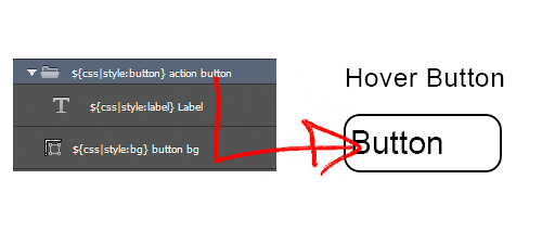
Use CSS Style Tag to add custom PSD to CSS styles to your Photoshop layer elements. You are not restricted as to which Photoshop layers you apply your CSS styles to, but you must note the parent-child relationship with your PSD to CSS styles.
This will add CSS classes in the output for each layer element.
Your parent-child relationship in your PSD will allow you to add custom CSS selectors, and specify direct CSS3 styles applied to elements within specific parents. This is important when using CSS styles in your Photoshop design as this allows you to add custom CSS states (eg. :hover) to both the parent and the child elements independently.
Eg. If you add a${css|style:label}within a${css|style:button}then that label style will only apply if the parent object has the button style applied.
Eg. You can now control both thebutton:hoverandlabel:hoverCSS states independently.
Step 2: Add a custom Hover State
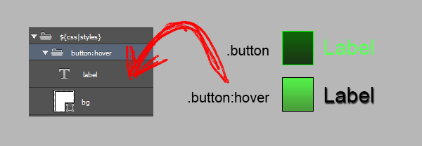
Create a similar parent-child structure within your CSS Styles Folder Tag, as you did in Step 1. This will maintain the specific CSS selectors required to control the :hover states of all elements included within the botton CSS style.
Add the custom effects you want enabled when the mouse hovers over the button element.All children of the button:hover folder will render with the supplied styles based on the parent-child relationship in your CSS styles folder. This will force each child element to render its :hover state using the supplied style.
NOTE: This also applies to other CSS states such asbutton(normal), orbutton:active(press).
