Optimization Tips
Optimization can be a tedious task, but often necessary. No one is perfect, so we put together a set of tips and rules to follow when designing your project.
These are common issues we have found and solved for users. We recommend you check all tips as your issue may already have a solution present.
If you still can't find a solution to your problem after reading our tips, contact us and we can help you.
Design Tips
Organize Content Blocks
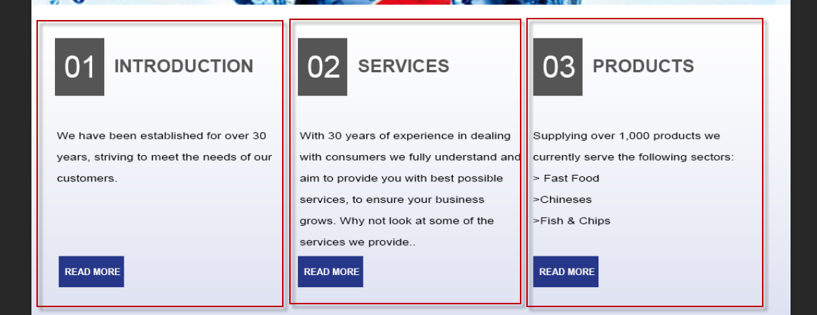
You should always organize your content in individual containers/groups. If you cluster elements into a single folder, that is how you output will render. The more folders you use, the more organized your output. Organize […]
Caution With Effect Size
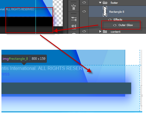
Depending on your effect and the angle, your element size may change to reflect the effect applied to the element. Web-based environments such as HTML and CSS, do not use run-time filters – but rather […]
Consider The Element Area

Its very common to mistake a complex shape’s visual design as its measured area. Always remember elements in all programming languages are treated as a rectangle area – regardless of the inner shape. Although shape […]
Trim Extra White-space
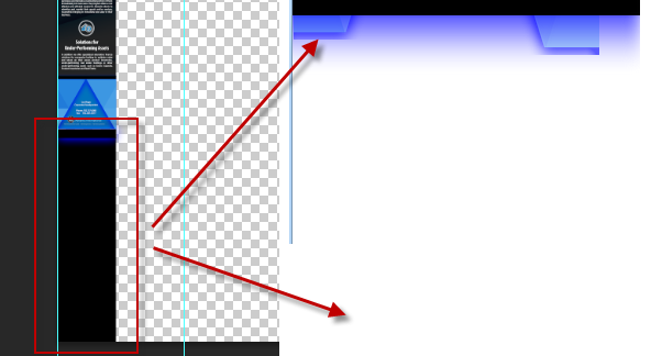
Your Output will always render based on your design. You should always try to fill your PSD document design or trim the remaining White-space to avoid display errors in the output. If your Photoshop background […]
Group Common Layers
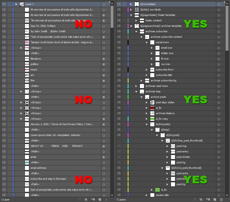
You can design anything with any layer organization when it comes to print, but when you are designing for an export – you must group and organize common layers. What you see is what you […]
Folder Tips
Skip Empty Folders
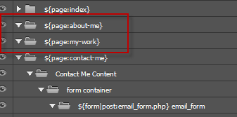
It is very common to create a container for a design to be used later. With Eport Kit, empty layers are treated as ERRORS to ensure clean designs. If your document contains empty layers or […]
Folder Order Is Important
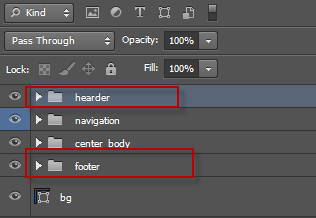
Folder order is important for most designs, and is required for both Dynamic Height and Responsive CSS. Your folder oder will directly reflect the order of the elements in your code output. Incorrect layer/folder order […]
Keep Elements Relative
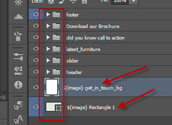
You should always place layers inside folders to avoid display errors. When you stack layers outside your container folders, this will reflect in the output – and may lead to unwanted element placement. Working With […]
Visual is Not Always Actual
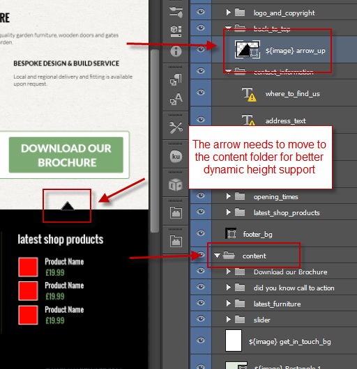
There are situations where a design may use elements which bleed into one-another. With regular exports this is not an issue, but with advanced exports such as Responsive Websites and WordPress templates – you must […]
General Tips
Caution With Document Size
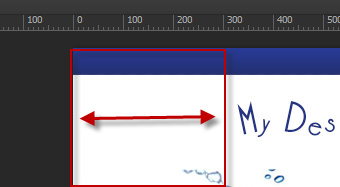
Your Document size will reflect your output size. If you have a visible margin with your design, this margin will translate in your output and may cause an unwanted display. Export Kit will render WYSIWYG, […]
Use Valid Layer Names

You should always use valid and common layer names with your content to ensure readable output. When you use incorrect layer names, most environments will throw errors as not all naming conventions are valid. Caution […]
Check Your Memory Usage

Some Photoshop files may seem to have a very slow export. In these situations, check your Photoshop Memory usage in your System settings to see if your PSD file has any leaks. If you notice […]
Use RGB Color Settings

Many designs may start as CMYK, but most environments only support RGB color modes. To be safe, always design in RGB.
Use Unique Layer Names

Export Kit will always try to convert each layer name to a unique name, but there are situations where layers with the SAME name can cause display errors in the output. Always use unique names […]
Valid Text Characters

Not all environment support all characters. If you are using special characters in your output, its always safer to use the ASCII value – then convert the ASCII to your project encoding. NOTE: many environments […]
Convert Adjustments and Masks
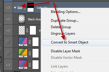
We do not currently support Adjustments and Masks, so we recommend you convert these elements to Smart Objects.
Use Shapes To Save Bandwidth

If your design has a solid color, or an effect that can be applied to a shape – then use a shape! Images must always download to the client computer costing additional bandwidth. To reduce […]
Some Names Are Reserved
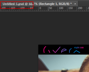
Some names in both Export Kit and other environments are reserved and you cannot use them. We cannot list all reserved names (there are many), but Export Kit has a specific few: Invalid Names (DO […]
Place Dynamic Layers Inside Folders
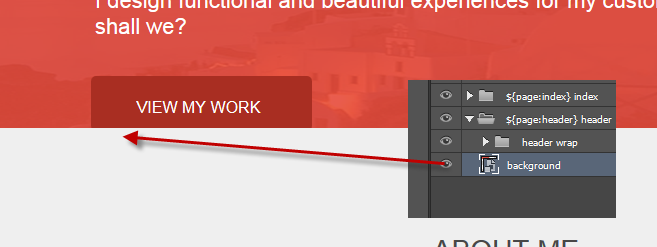
When you enable Dynamic Height with your pages, your content will stack similar to a Table Row. You must ensure you place your layers inside a main folder, otherwise you may have unexpected display errors […]
Layer Tag Tips
Do Not Nest Pages
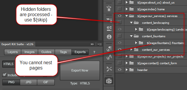
You cannot NEST pages – simple.
Place Margins Respectively
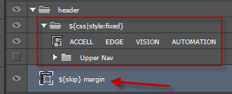
Margins should always be placed within their respective container. If you want to add a margin to the Header, then you must place your margin within the Header folder.
Tag All Required Pages
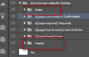
Some environments such as WordPress and PHP have strict rules for generating content, and require default pages to render. If your environment requires a ${page:header} and ${page:footer} – then you must include theses tags.
Use Valid Tags For Elements

When adding Layer Tags to elements, you should always be aware of which tags work with which elements. If you place a Layer Tag on an incorrect element, you may have unexpected results – but […]
Place Responsive Elements On All Screens
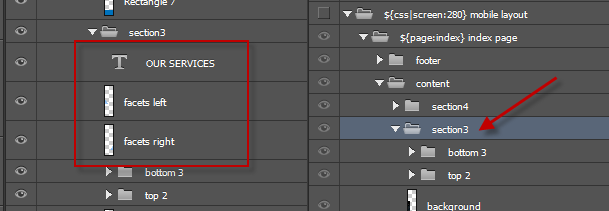
If your project is a Responsive Design, then you must follow our guide to Creating Responsive Screens to ensure all elements are correctly labeled and placed where required. Responsive Designs can become very complex depending […]
Maintain Responsive Layer Names
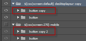
DO NOT change the layer name of your responsive elements. You can change anything else – but DO NOT change the layer name – this is a CSS rule.
Move CSS Styles Folder Up
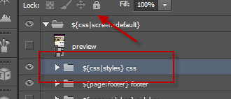
CSS Styles are unique in nature to Export Kit and require you to place the folder at the very TOP of your document. CSS is compiled in order – last in, last out. This means […]
Industry Standard Rules Apply
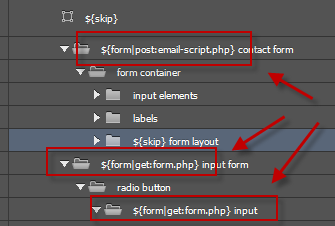
Export Kit makes it easy to create complex elements inside your PSD, but if you incorrectly tag elements – or place elements in an illogical order – you will have unexpected display errors. In the […]
Shape Tips
Rasterize Complex Shapes
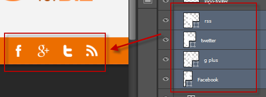
If you have an issue with complex shapes, or a group of shapes – we recommend you convert the elements to a Smart Object or rasterize the shape. This can happen when you are using […]
Use Stroke Effect For Borders
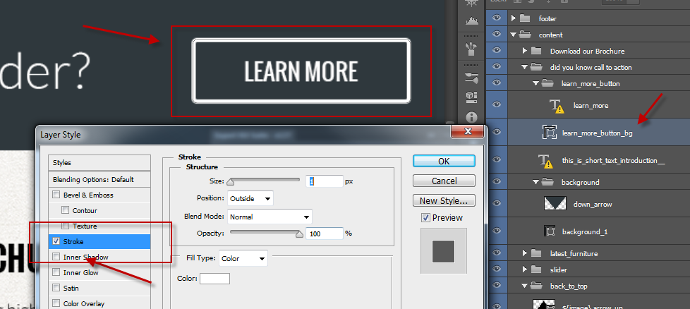
Shape borders are considered an effect in many environments so Export Kit uses the Stroke Effect to render shape borders.
Text Tips
Use Valid Text Layers
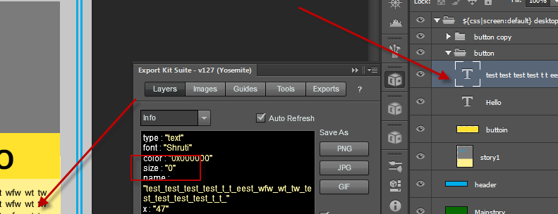
When text layers do not render correctly, the first thing to check is the size of the element in Layers View. If you notice the size is 0, your element may not be a valid […]
Change Your Text Names
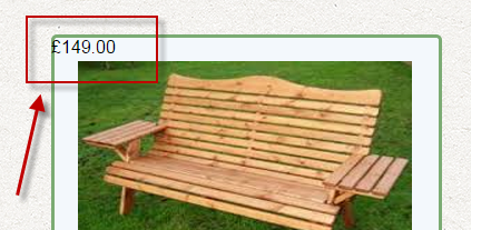
Photoshop will use the text contents of layers as the name. There are some cases where a designer may use a price, phone number or address – which can result in an invalid layer name. […]
Do Not Scale Text
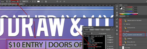
This is possibly the most common designer error. If you design changes and your text needs to become larger – do not scale the text, but rather change the font size. Export Kit will always […]
Caution Bleeding Text

This is another very common mistake where a Designer may draw the text area much larger than actually required. By default this will not have an effect on your visual output, but this may affect […]
Menus Require Individual Elements

Do not create a paragraph, and add your Menu labels inside the paragraph – then go further by adding spaces between. This is a MOCK-UP Menu, not an actual one. You must always consider that […]
Use Correct Text Settings
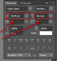
If you have display errors that are text related, you should double check your font size and line-height size in Photoshop. If you have an invalid setting (eg. your line-height is greater than your font […]


